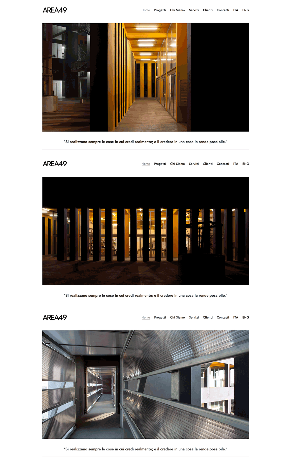
Area49 - a new website for a new venture
4 architects based in Milan decided to merge their practices under a new label, so they contacted Andrea and I to create a visual identity and a website for their new studio: Area49.
Being the union of 4 different minds, the brand had to work well with their previous production and, at the same time, convey the right tone for future projects.
That’s why we kept the palette to a minimal black and white, also to better complement the beautiful portfolio pictures, which hold a central role in most pages.
Another major task in the project was the design of a logo for the brand. The clients asked for a minimal lettering that could match the core concepts behind Area49: union, plurality, sharing of ideas. We ended up using a very geometric font (Code Pro), moving all characters close to each other and merging the word and the number, to highlight the bond between the partners.
A collaboration w/ Andrea Giambelli for fondaco.


